
12/5/11
A brief pause,
With the last week of school on it's way and finals coming up soon, I'm going to have to put a hold on updating until I can get the massive pile of work moved from "not done" to the "well I'm glad that's over" bin. See ya soon!
11/29/11
Sketch Dump
Hey guys - I've been workin' in the sketchbook pretty regularly and I just wanted to share a few pages from it. Below are a few of my more recent drawings. I've been working along the lines of creative / intuitive / zentangle drawings. I did these sketches with pen and marker, but enough of that, I'll let the drawings speak for themselves...


11/25/11
Spider-Man Sketch

(Ink/Marker/Watercolor)
11/16/11
A Little Overdue
Hey everyone, sorry for the lack of updates - thanks for being so patient! I've been pretty busy recently, so let me fill you in. For those of you not interested at all by what I've been up to - just scroll down and take a look at the art, it's probably more interesting anyways.
Recent updates in the life of Vic:
Besides losing power for a week due to that freakish snowstorm we got in October I have been ridiculously busy with school, frankly the work load has been running me dry and I've lost motivation to do little else than sleep and watch TV in my (rare) instances of downtime. For those of you unaware: I am currently attending Central Connecticut State University as a graduate student pursuing a teaching certification in art (ie: being able to teach art classes in public schools grades K-12). Besides the regular routine of going to class I am also required to do field work/observations at various public schools in the state. I have to say, the hands-on experiences are some of the most important educational elements to learning about being a teacher. Not only am I sharing some of my experience with students, but I am learning new things from them as well. Alright, well enough of that, onto the art stuff!
Art Stuff:
As aforementioned, I've been so busy I haven't had a lot of time, nor been motivated to do a whole lot of personal art. I have a lot I want to share, though unfortunately I am not currently in possession of it (much of it has been submitted for class). No worries though, I do have a few things to share. In addition to some of that artwork, I tried my hand at a daily sketch log/sketch journal/ whatever you want to call it. I was really inspired by fellow Uconn graduate and illustrator Adam Del Re, you can see his work here: lifeDRAWINGS. I had a lot of fun in the beginning, and I learned a lot, it was quite the experience. But, to be completely honest, as school/work/life took it's toll I became unmotivated and it became more of a burden trying to keep up with it on a daily basis rather than something I looked forward to doing. I think I'm going to dive back into the idea and do something with it. I'll probably share a few in another blog post. Ok so let's take a look at what I've got:

(Ink/Marker/Crayon)
This is a Zentangle. I won't really get into it too much, it was something simple and colorful that the students I was working with were doing, so I sat down and worked with them for a short time and made this. Zentangles are traditionally more complex and interesting, but this was just a quick assignment to get a feel for what the students were doing while conversing with them about their experiences in class.

(Ink/Colored Pencil)
This is a Creative Line drawing that was assigned in one of my art classes. Each of us grabbed a piece of paper and drew one line, the papers were shuffled up and randomly distributed to us. We were to take the line drawn on the paper and create a drawing and color it using colored pencils. The line i was given was made into the outline of the creature's head - starting on the left-side of the page, into the opening of the mouth, and around the top of his head to the right-hand side of the page. I traced over the pencil line with ink and added in my own features (teeth, tongue, eye, nostril, squares in the background, etc) and then colored it in with colored pencil. It was actually pretty enjoyable.

(Crayon)
This is an intuitive drawing I did while working with students. It was their assignment for the day, they had a variety of media to work with but I went with the crayons - because quite honestly I like working with them (nostalgia perhaps?) Anyways this was fun and therapeutic - just drawing without any goal - considering my recent levels of stress I gravitated toward this style and created the following:

(Crayon)
This one is the result of de-stressing right after a major exam in class. I really liked the use of the black in this. I've always liked the quality of outlining things (obviously not appropriate in all art) so I use it often, also maybe it's a way of sticking it to professors who claimed that black/outlining were inappropriate to fine art.

(Crayon)
Scanning this one really doesn't do it justice to just how bright and vivid the colors are. I'm disappointed with how it looks on-screen. I did this one sitting around at night before bed. Exploring using some imagery that's less than abstract (ie: the eyes), but still not going for anything realistic or defined.
Thanks for hangin' in there, I know that was a long post! I'll be getting up some more work soon!
10/31/11
Happy Snowalloween!
Hey everyone, I have some stuff I want to put up, but I'm stuck without power due to that crazy October snow storm. So no scanner/computer/internet. I was lucky enough to be able to update this from another house. So stay warm! I'll be posting updates as soon as I get power and internet back.
10/8/11
New ride

(Digital)
10/3/11
Drooling...

(Image borrowed from wacom.com)
Wacom has an even NEWER Cintiq?! Wow. Don't get me wrong, I'm more than happy with my current setup, but it's hard not to look at the new shiny things. If you want to drool over the new shiny thing too, check it out on there site here: WACOM 24HD Cintiq
9/29/11
Gears of War 3

(Digital)
Hey all! I know it's been a while since my last post, I've been pretty busy between graduate school and working on my Gears of War 3 submission. I've finally finished it! It was definitely a step outside of my comfort zone. I've worked digitally many times before, but this time I tried something new. With this piece I worked on the entirety of the drawing in black and white and then colored it using various filter layers containing color. It was a learning experiment, and I'm glad to have done it, but I don't think it's a method I'm going to be using again (at least to do an entire drawing). If you look at the previous post, I took a very different turn with how I was going to render this drawing. As I mentioned this was a submission for the Gears of War 3 contest on DeviantART. It features the character - "Anya Stroud" from the game. You can view my entry here: Anya's Stand. This is a desktop background (per the submission guidelines it is 2560 x 1440 pixels). The image above is full resolution, feel free to download it and use it as your desktop background! All the work is copyright me, Victor Preato IV, and the character(s) and logo(s) are copyright Microsoft (I think...they own Gears right?). Enjoy!
9/17/11
GOW work in progress

(quick snapshot of my WIP - working in Photoshop)
Well I don't want to give too much away - and to be honest I don't really like showing my works-in-progress a whole lot...BUT I've been working on this little project for a little while. At least... I've been trying to, I've had some serious Art Block, and I'm pretty excited to be over/under/past/through/done with it. So in my excitement, I just decided to post this up. I know it's not a lot, but no worries, there will be more soon. I'm finally having some fun AND I'm back working in Photoshop on the tablet. Poor thing had been sitting on the table for weeks...
9/13/11
Zombie Brainstorm

(Ink, Marker, and Digital)
Sarah's Drawing - sarahlouiselovesart.blogspot.com
Jacob's Drawing - jacobandersonart.blogspot.com
9/8/11
Back to the Futura!

(Image borrowed from: artsupply.com)
Well I still don't exactly have a studio like I USED TO, but I did get a new drawing desk (and chair) so at the very least I've been able to set up a solid work station. I'll avoid rambling on about how important I think it is to have a working space to keep you motivated...the fact of the matter is I think it is very important (it helps keep me organized). So needless to say I'm thrilled to have a new drawing desk. In case you're curious about what I bought, it's a "Futura Craft Station" (see above image).
9/1/11
I have an inkling on this one...
Well I don't normally do "reviews" (I guess it's not a review since it's not out yet, nor do I have one...), but I have to say I'm pretty excited about this one, and to be completely honest, I'm not quite sure when this was announced, so I may be a bit behind the times...

Anywho, just the other day I came across Wacom's newest gadget: the "Inkling." As an artist who's used and owns a few of Wacom's tablets, I'm really excited for this. Wacom is really getting into the whole idea of being able to draw digitally with it feeling like it's traditional. From my understanding of the videos and what I've read, the inkling allows the user to draw traditionally with their new Inkling ballpoint pen in a sketchbook or wherever, and the sensor placed on top of the page captures all of your movements with the pen and creates a digital file, and not just a .jpeg image. Apparently the sensor allows you to work in layers and to create vector images from your drawings, all without a need to scan your original drawing. Oh and the Inkling doesn't need to be hooked up to the computer when you use it - you only hook it up to transfer the drawings via USB. I think this is a great way for those of use who aren't comfortable with drawing digitally to step in with this unique blend of the traditional and digital. With a projected price of $199 I think it's reasonably priced (though we'll see how much they charge for ballpoint ink replacements). I look forward to hearing more about this product after it comes out. Looks like something I may be needing to pick up.
Check out this video by Wacom explaining everything I just said a little better:
(Image borrowed from tehnabob.com)
Anywho, just the other day I came across Wacom's newest gadget: the "Inkling." As an artist who's used and owns a few of Wacom's tablets, I'm really excited for this. Wacom is really getting into the whole idea of being able to draw digitally with it feeling like it's traditional. From my understanding of the videos and what I've read, the inkling allows the user to draw traditionally with their new Inkling ballpoint pen in a sketchbook or wherever, and the sensor placed on top of the page captures all of your movements with the pen and creates a digital file, and not just a .jpeg image. Apparently the sensor allows you to work in layers and to create vector images from your drawings, all without a need to scan your original drawing. Oh and the Inkling doesn't need to be hooked up to the computer when you use it - you only hook it up to transfer the drawings via USB. I think this is a great way for those of use who aren't comfortable with drawing digitally to step in with this unique blend of the traditional and digital. With a projected price of $199 I think it's reasonably priced (though we'll see how much they charge for ballpoint ink replacements). I look forward to hearing more about this product after it comes out. Looks like something I may be needing to pick up.
Check out this video by Wacom explaining everything I just said a little better:
8/31/11
Missing : Mario and Luigi
Well I was sketching in my book and one of the shapes took the form of the Piranha Plant from Super Mario. From there I decided it would be fun to just sketch some more baddies from Nintendo's flagship series. I have to say some of these enemies that Mario (and Luigi - sorta) have to overcome are pretty interesting. Of course over the years there have been TONS of new baddies for this plumbing duo to overcome, but I selected a few that stuck out in my memory. So who do you think is the biggest threat?


Piranha Plant: Just got to watch pipes for these guys.

Bomb-Omb: Child friendly suicide bomber

Boo-Buddy: Patience is the key, considering you can't hurt them.

Bullet-Bill: Not sure if he wants to eat Mario or put a hole through him.

Goomba: Ok I know he can walk, but seriously, how is he dangerous?!

Koopa-Troopa: General Shock-Troops with a few neat variations.

Lakitu: Ok this guy was a pain. Even if you managed to miraculously take him out, he reappeared.

Podoboo: These guys seemed to pop up every time you tried to jump over a pit in one of Bowser's castles.

Shy Guy: I just think these guys are fun looking.
8/27/11
Brought to you by the letter "G"

(Ink and Marker)
Well I've started work into a new sketchbook, and I'm hittin' the ground running so to speak. I'm already starting to fill it up with a bunch of new sketches and weird drawings. The above picture is one of those odd drawings, that frankly, I don't know if I could just come up with off the top of my head without the process that goes into creating it. I like to do a lot of random drawings in my sketchbook that have no basis in anything other than just making it for fun. For these drawings, I typically start off with non-photo blue pencil and start sketching some random lines, OR begin with something like a letter of the alphabet (Like the letter "G" for example as seen in the above sketch). From there I ink it in and adjust the drawing as it starts to form, and finally color it in with my Prismacolor markers.
8/25/11
Rewind to vacation (I wish)
Well I finally got around to scanning a couple of sketches I did on vacation. I had a great time, and I got along great with my family - though, it's fun to do some drawings of them. So not a whole lot to explain here. I think the images speak for themselves. All done in my sketchbook, pen and ink.


8/23/11
Well he IS quite a character

(Ink and Marker)
I feel this one is going to need some explanation. The guy in the above picture is my good friend and fellow artist, Trevor Schulz. Trevor put together a little group for some of us recent graduates so we could keep up on work, give critique, and support each other. In addition, we would create little "assignments" to keep us in an illustration mind-set. (Plus it's fun). I had suggested as our next assignment we would draw a favorite character. Well, it wasn't long before someone suggested that Trevor would make an excellent "favorite character" drawing. Sarah did her drawing, then Jack, and of course I had to set my original idea aside and follow suit. Here's the links to some more drawings of Trevor:
Sarah's Drawing - sarahlouiselovesart.blogspot.com
Jack's Drawing - thejackboyd.blogspot.com
Jacob's Drawing - jacobandersonart.blogspot.com
You can find the ever-loveable Trevor's facebook page HERE
8/21/11
Who's the joke on?

(Digital Media)
8/13/11
Sneak Attack!

(Ink and Digital Media)
Well I was just messin' around in my sketchbook and this little guy formed out of it. At first I was thinking something along the lines of "Oh the robot is going to interact with some life on Earth and really appreciate it.", but that seemed kind of corny, so I figured as much as he might seem intrigued by the butterfly... he was really out to capture it the whole time. Guess you need to have weird thought processes like that sometimes? Anyways, I scanned the image and threw it into photoshop, where I added the halftone pattern.
8/12/11
Some updating...
Hey all, sorry for the delay on putting up some new sketches/work. But I've been busy updating this blog layout (as you may have noticed), and creating my deviantART account. Which you can find HERE, or just click the button at the top right hand part of the screen (at least that's where it is for now, as of this post...) I have a few new pieces in the works that I'm excited to share once they're complete! Until then I'd like to leave you with this quote by an unknown author:
"Let me ask you something, what is not art?"
"Let me ask you something, what is not art?"
8/5/11
Dance to the music

(Ink and Watercolor)
8/4/11
Some more watercolor practice

(Ink and Watercolor)
8/3/11
He might blow you away

(Ink and Watercolor)
To leave a post on my facebook page, click HERE, "Like" my page, and drop me a line. I'd love to hear from you!
7/30/11
Poor Cutman


7/29/11
I would have used both

(Ink and Marker)
** Disclaimer -- I did not do my hardcore Megaman fan research on this one, so maybe it's because he's only allowed to have one at a time? I don't know, still think two would be pretty cool though.
7/28/11
Now that's using your shield!

(Ink and Marker)
7/27/11
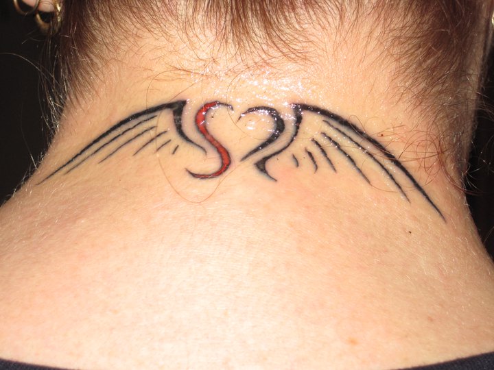
Memoriam Tattoo Update
Hey all, I'm back from vacation and I have a few new images to post for you soon. For now I'd like to share a follow-up on that tattoo I designed. I just got this image of the completed tattoo. Take a look! (To see the blog post about the initial design take a look HERE.)

7/16/11
Found it!

(Ink, Watercolor, and Guache)
On a side-note, I'm going to be away for the next week and it's questionable if I'll have internet access. But no worries, even if I can't get a blog post up - I'm definitely going to be bringing my art supplies and whipping up some new stuff.
7/15/11
Definitely a time waster

(Ink and Pen)
Well here's a quick sketch for the quote:
"Time is what we want the most, but what we use the worst."
- William Penn
I didn't have a whole lot of time to squeeze this one in, but the quote made me think immediately of what I waste a lot of time doing. I would say it's a safe bet that I can get lost for hours stumbling or browsing the internet, but facebook takes the cake when it comes to things that I spend too much time looking at.
7/12/11
New Ideas

(Ink on Paper & Colored Digitally)
Hey all, I know it's been a while since my last post - and I still have a bunch of new stuff to put up, but if you'll bear with me while I get stuff scanned, I do have this new image today. This illustration is for the quote:
"Man's mind, once stretched by a new idea, never regains its original dimensions."
- Oliver Wendell Holmes Jr.
I really enjoy creating illustrations for quotes, or at the very least, ones that are inspired by quotes. It's a fun challenge to come up with something interesting that speaks for itself and yet relates back to the original text. I personally like to stretch it a little and not create something that is too literal to the quote. Anyways, enjoy! I'll be posting new work soon!
6/28/11
Memoriam Tattoo

(Digital Media)
**Update** Check out the completed tattoo:
6/14/11
I usually attack it with a spoon. . .

(Digital Media)
I really like drawing inspiration from quotes, so today I looked up some random quotes and found this one from Kurt Vonnegut:
"Any reviewer who expresses rage and loathing for a novel is preposterous. He or she is like a person who has put on full armor and attacked a hot fudge sundae."
For whatever reason, I got a fun image in my head and decided to sketch it out. The above image is just a quick sketch and was done in about 30-50 minutes (I suppose I should start keeping better track).
6/7/11
Well, I finished it

(17x11 Ink and Watercolor on Illustration Board)

(In-Progress coloring)
Subscribe to:
Posts (Atom)